Improving comprehension while saving £300K in development costs

Background

Smart Retire is a service application that helps users manage their pension savings in retirement.

Product had gathered findings that users didn't understand how key functions worked. They proposed a product tour as a way to solve this comprehension gap.

Challenge

Partner with Product and Design to evaluate a proposed product tour, diagnose root causes of customer confusion, and define a strategic way to improve comprehension.

CLIENT

Smart Retire

INDUSTRY

Financial services

ROLE

Lead Content Designer

TEAM

Product, Engineering, UX Design, UI Design, UX Research, Compliance

Outcomes

✅ Prevented unnecessary product tour development, saving £300K+ of capacity costs

✅ Standardised flows, patterns, and language across Smart Retire

✅ Improved IA and microcopy to increase comprehension and reduce drop-off

✅ Created a functional baseline for future iterations

Discovery and audit

I reviewed user research, analytics, and interaction data to understand the root causes of user confusion.  

I led heuristic evaluations with the design team, unpacking use cases and screens and grouping observations using Gestalt principles.

Collaborate to pivot product strategy

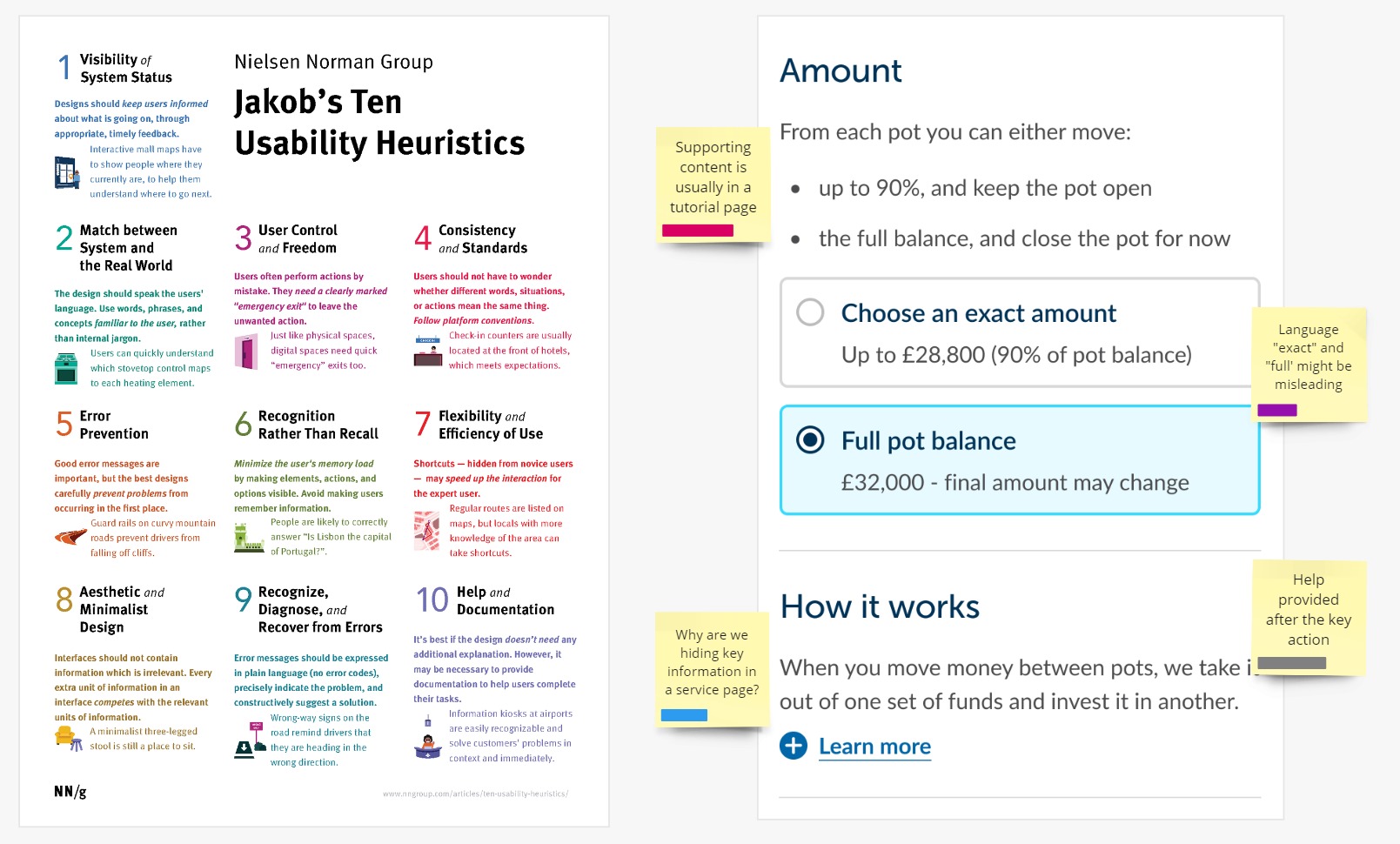
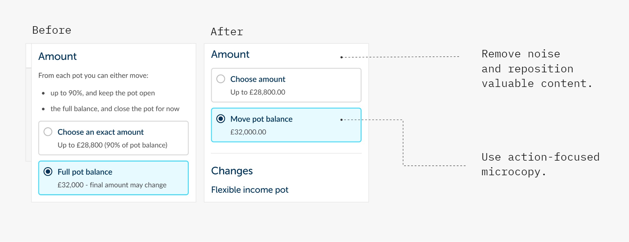
My findings showed that the root causes were structural:

  • inconsistent information architecture
  • unclear language
  • overloaded touchpoints

This signalled that, without foundational improvements, a tour would mask but not solve the problem.

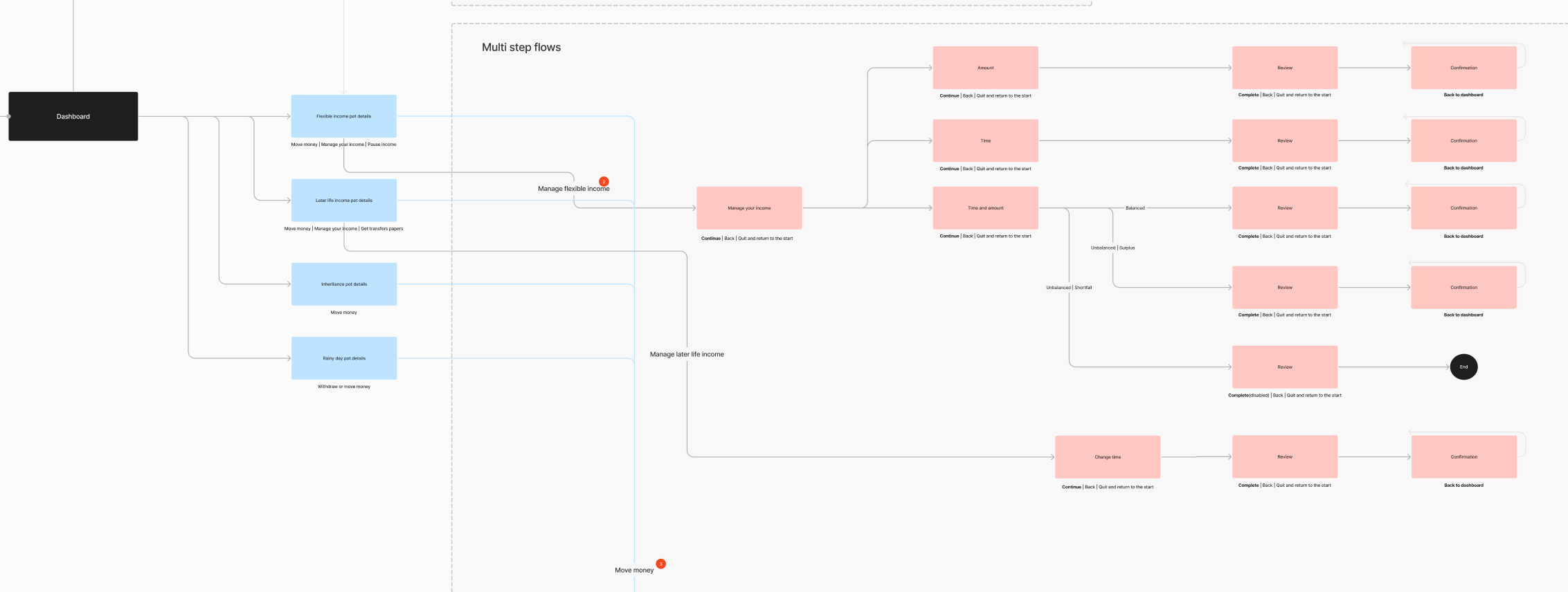
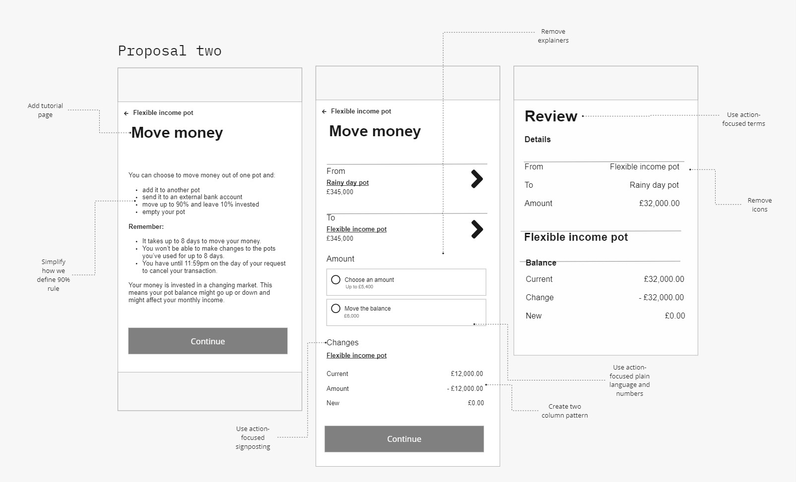
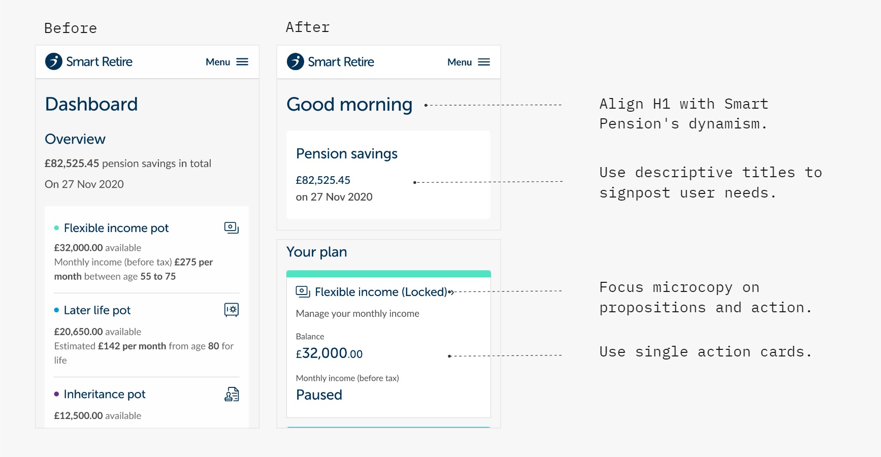
We hypothesised that removing frictions in usability would improve comprehension directly within the product experience.

Prioritise and refine requirements

I collaborated with Product Managers and UX Designers to negotiate iterations, define new requirements, and align changes with the design system.

This included:

  • Prioritising improvements within the sprint and engineering capacity
  • Mapping IA gaps and proposing new content types
  • Leading workshops to align product, compliance, and design on content decisions

Design and Delivery

Simplifying user flows and interactions

I partnered with UX Designers to redesign how information was organised and presented across the service journeys.

This included:

  • Introducing tutorials to build context and onboard users progressively
  • Repositioning content to support decision-making and task completion
  • Removing redundant components and microcopy to reduce cognitive load

Designing with accessibility and compliance

I worked with Compliance to ensure improvements met regulatory requirements while maintaining accessibility standards.

This meant:

  • Aligning with compliance requirements on terms and conditions
  • Applying progressive disclosure to reduce  cognitive load at each touchpoint
  • Meeting WCAG standards for all interactions and content


Visual hierarchy - Smart Retire - Dashboard - changes

Designing for progression and simplicity

I refined content to support scanning and comprehension, including:

  • Redesigning headings to signpost user needs and next actions
  • Adjusting visual hierarchy to emphasise decision-critical information
  • Simplifying financial microcopy using plain language and numbers
Visual-hierarchy-radio-actions

Why it matters

This project demonstrated how data-driven discovery can shape product strategy and support smarter retirement journeys.

I defined an IA approach that clarified complex decisions and reduced user drop-off risk. This provided a strategic framework that product squads now use to evaluate, prioritise, and refine feature requests.


Shopping Basket